
My Role: Leader, Moderator, Researcher, Designer
Tools: Miro, Figma, Teams, Discord
Process: Goal-Directed Design (GDD)
Timeline: 4 Months (January to April 2022)
Summary: Aardvark Accessibility is a web-based application designed for novice designers to assist them in being an educational tool for any and all web accessibility related scenarios they will face. During the course of 4 months, I led a team of myself and three others through the Goal-Directed Design (GDD) process to ideate, research, design, iterate, and eventually present our high-fidelity prototype.

Goal-Directed Design is a collection of stages created as a tool that helps designers find and meet users' goals and needs. It also helps address the needs of businesses and sites that will be dealing with users of all types. Like most projects, one has to start out with research, this step focuses on interviewing potential users as a means to collect data and find and better understand users' goals and desires.

In our beginnings, we started with a kickoff meeting where we developed our problem statement from our own personal experiences. We assessed that the current state surrounding novice designers and their relationship with web accessibility was poor if not non-existent. In order to solve this issue and bring the two parties closer, we envisioned a product that housed any and all tools and resources that a designer could use. By doing so, we found our problem statement: “The current state of accessibility for designers has focused primarily on the designer’s independent research. What existing products fail to accomplish is an easily digestible and central hub for resources and tools for designers to utilize. Our product will address this gap by creating a single source of truth where any and all resources needed for designers will be housed.”

In our research phase, we decided it would be best we designed for novice designers, since that is who we were. We also decided on making this site a final destination for those designers when it came to learning about web accessibility guidelines. At a quick glance, we couldn't find any competitors who already had a functional "one stop shop" regarding tools and resources about web accessibility. Before conducting our interviews, we wanted to first get a better grasp on what resources were readily available for designers to find. This ranged from online documents, industry reports, and various online articles and web searches to complete our collection of resources. We did not have stakeholders during our process, but through our research we have assembled, we can confidently conduct stakeholder interviews and discussions to gather a different perspective for our next approach. When we began searching for content on the internet, the first document we found was the Web Content Accessibility Guidelines (WCAG). This document was the metaphorical "grail" for our research, anything that could be found regarding web accessibility could be found here. One problem, the hierarchy of this site was anything less than pleasant to navigate. Nonetheless, this was our most essential resource regarding our research phase since every person in the group had limited knowledge regarding web accessibility.

We conducted our competitive audit to see what types of services existed regarding web accessibility. When choosing what platforms we wanted to consider, we looked at web accessibility platforms and instructional platforms. We chose these platforms considering we were making an instructional site about web accessibility. We took the time to see what instructional sites had in them that made them successful/popular among most demographics. Pictured below is a condensed chart showcasing several popular learning platforms that we reviewed, there were 13 in total which resulted in such a large chart, it could not be appropriatey displayed.

After several weeks into researching web accessibility, we recruited four participants (three are pictured below) to get an outside perspective on their knowledge of web accessibility, this would help us create our persona and overall help us decide who to design for. Two of our participants were graduates and two were finishing up school so we had a good industry mix from our interviews. When it came to the contents of our interviews, we developed questions around categories that pertained to how our participants preferred to learn, what their knowledge of web accessibility was, and their preference for how informational content was delivered. During the moderation, we also asked follow-up questions to find any annoyances among the participants had regarding informational site structure.


We compiled our notes from each interview and wrote down key points from multiple sections of each interview and grouped them together to create our key findings. This would help in the creation of the goals and aspirations of our primary persona, Zara.

From our interviews we found several key insights:

Zara Harper, our primary persona, is new to the designer scene. She is fresh out of college and eager to make a difference at the startup that just hired her. While not knowing much about web accessibility, she spends her free time researching and learning as much as she can about it. Zara is a hands-on learner and prefers having photos and videos mixed in with her instructions. Due to the influx of biased information, she needs to make sure that the information she is getting is reliable and as unbiased as possible. Although she is used to long word heavy articles about accessibility, she hopes for a way to make learning such more engaging.

Like most things, they require change. This is especially true for our problem statement, after taking time with our research and persona creation, we revised our vision statement to clarify more of what our goals were and how we will be filling the space that is the lack of web accessibility knowledge:
“The current state of web accessibility resources for novice UX Designers relies heavily on independent research and is poorly structured, making it difficult to digest. Existing resources are made up of complex information and an over saturation of biased articles. What they fail to accomplish is communicating accessibility guidelines that are intuitive and comprehensive. Our product will address this gap by creating a central hub that ensures our accessibility content is engaging and tailored to our users’ learning styles. This will create a desire to learn accessibility so that users can develop designs that are accessible to all.”
With our revision, we created our vision statement to voice our problem and solution to users and not so much the "business" side like our problem statement covers:
“The design for our accessibility resource will help users learn and engage with web accessibility guidelines by allowing them to interact with the content directly through their preferred medium of instruction and learn at their own pace. By creating a tool that intuitively guides designers, allows users to access information from a single source, and provides users with a stress-free environment that allows them to learn at their own pace, our product will dramatically improve the delivery of web accessibility guidelines.”
In our requirement phase, we developed our persona expectations, a context scenario, and created our requirements for our product.
Tasks we completed in our requirements phase:


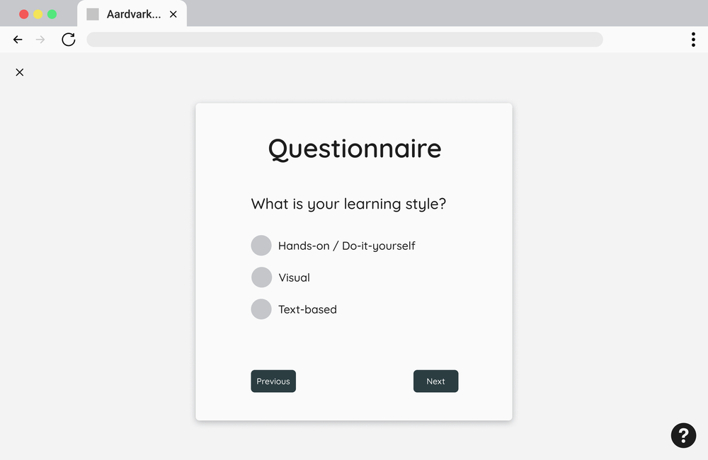
We started creating our low-fidelity (lo-fi) wireframes in Miro (then moved to figma after the design studios), the screens we included were to be made based off of necessity in our requirements list. This included our key path, which is the main path a user takes when using the site, and validation scenarios, which cover any infrequently used features that our user will come across. Our key path included the steps of logging into the site, opening a saved module, browsing through recommended modules and eventually finding another one to repeat the process.

After our scenarios were established, we conducted two design studios to start establishing ideas and styles for our wireframes and any possible future designs. Each studio consisted of a 5 minute period, the first studio was to choose a screen in the key path that our user would see and design what we thought it would look like (each member created something). We then voted on features and screens from the other members that we thought were good and took the time of our second studio to recreate another screen with elements we like from the previous studio. We then took these screens and added them to Miro.

After starting our lo-fi wireframing in Miro, we moved to figma to start creating more animated screens, here we prioritized function over visual design.


We started our refinement phase by reaching back out to our four, previously interviewed, participants asking them to participate in some usability testing sessions, This was beneficial in gaining feedback since our participants were familiar with the product.
We started our usability tests in a very structured way, this included a set of tasks and scenarios that the participant was given to complete. We asked that they follow the "Think Aloud Protocol" (TAP) method when navigating through their tasks so that we could have some insight as to what was going through their head while working. After the first test we noticed that there is no structure when it comes to the curiosity of an eager user. So we loosened the reins and just used scenarios until we notice that the user was lost or sidetracked, this is when the author of whatever screen the user was on would ask questions regarding the layout and structure of the screen. The users were instructed to return to pages after their scenarios were complete to answer further questions from all of the members. This resulted in a more natural test and it allowed us to observe our participants in a more lax setting.
These were the necessary changes needed moving into our high-fidelity prototype. Many of these pain points were mentioned by several of our test participants. We collected a lot of things to improve upon and a lot of encouraging words about how this is a necessary tool for many.
Primary changes:
Secondary changes:

The final step of our process was to create a presentation video that showcased our journey to design our site. We made sure to cover how GDD was applied in each stage of the process and coved key points Aardvark Accessibility offered to its users.
This was my second project that I saw through from beginning to end while using GDD, and from comparing my skills and knowledge then versus now, I can say I have grown a lot. Like all projects, time was of the essence and to do what we did with our deadlines really resulted in a project I can look back on and be proud of. Not only has this project made me more conscious of web accessibility, but it also allowed me more opportunity to work with new people and tools I was not so familiar with.
With all of that being said, I would like to extend a big thank you to my team members and professors, I could not have done it without them.
If you like what you see and want to work together, get in touch!
ianoliverux@gmail.comGoal-Directed Design is a collection of stages created as a tool that helps designers find and meet users' goals and needs. It also helps address the needs of businesses and sites that will be dealing with users of all types. Like most projects, one has to start out with research, this step focuses on interviewing potential users as a means to collect data and find and better understand users' goals and desires.


